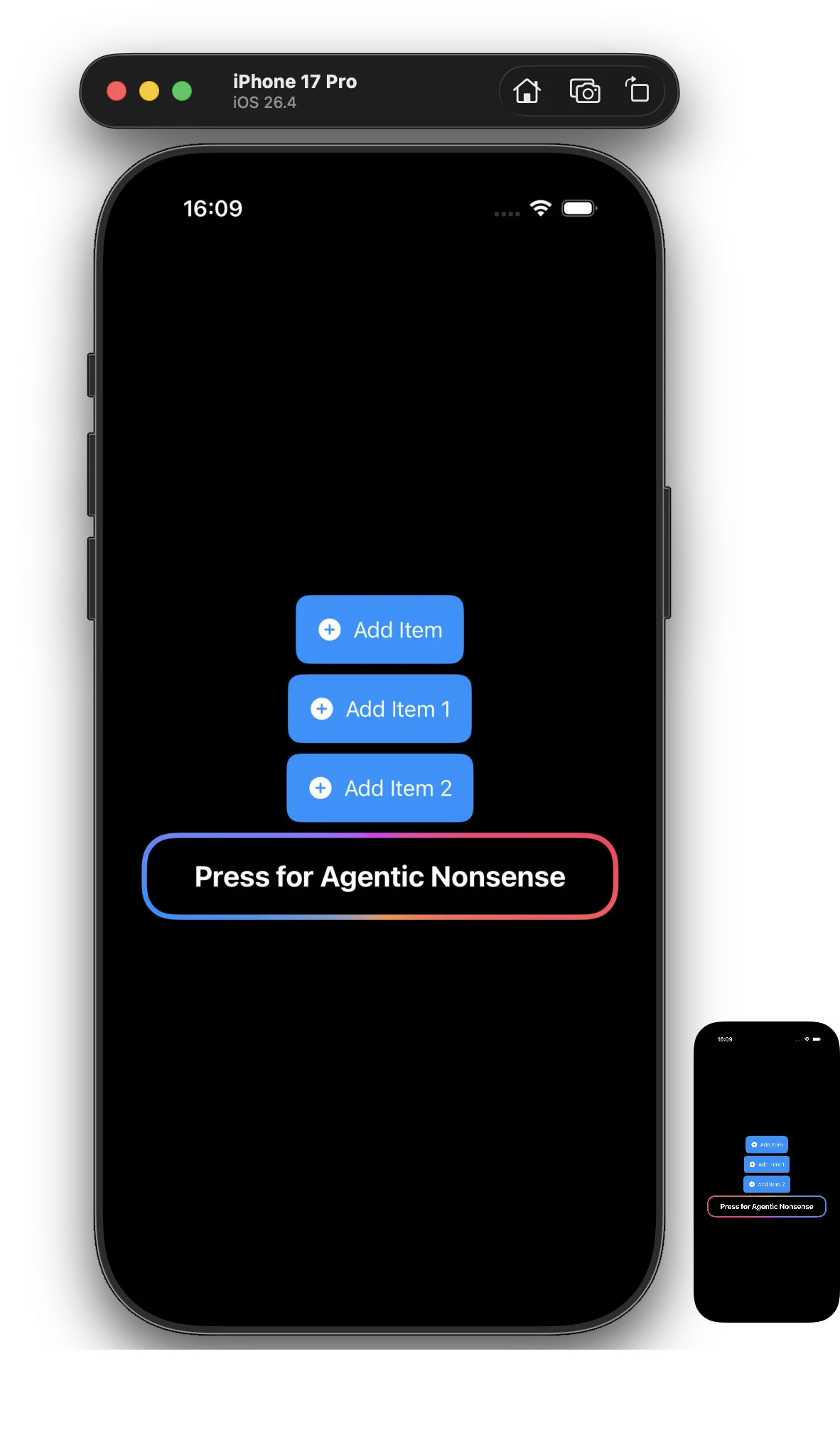

Create a gradient rainbow effect for a button to captivate your users and increase engagement.
This is because of Von Restorff effect - in other words the more something is standing out the more attention it attracts.
Here are some notable example of such UX changes:
- HubSpot: Found that changing a CTA button’s colour to one that stood out uniquely from the surrounding content generated 21% more clicks than their original design.
- Etsy: Swapped a yellow “Add to Cart” button for a vibrant shade of green that contrasted better, resulting in a 17% increase in conversions.
- Performable: Increased their landing page conversion rate by 21% simply by changing their CTA button from green to a starkly contrasting red.
Snippet
import SwiftUI

struct AnimatedBorderButton: View {
    @State private var rotate = false

    var body: some View {
        Text("Press for Agentic Nonsense")
            .font(.title2.bold())
            .foregroundStyle(.white)
            .padding(.horizontal, 40)
            .padding(.vertical, 20)
            .background {
                RoundedRectangle(cornerRadius: 24)
                    .fill(.black)
            }
            .overlay {
                RoundedRectangle(cornerRadius: 24)
                    .strokeBorder(
                        AngularGradient(
                            colors: [.blue, .purple, .pink, .orange, .blue],
                            center: .center,
                            angle: .degrees(rotate ? 360 : 0)
                        ),
                        lineWidth: 4
                    )
            }
            .onAppear {
                withAnimation(.linear(duration: 2).repeatForever(autoreverses: false)) {
                    rotate = true
                }
            }
    }
}
Preview